Overview
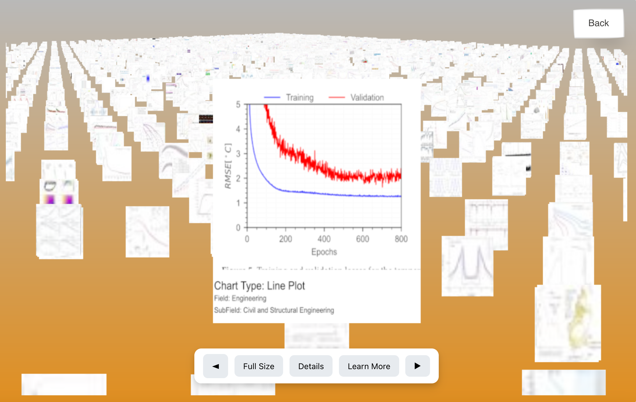
Vis-Sieve is a research-based project exploring how various types of charts and visualizations are utilized in academic journals. Focused on a small sample of Princeton journal data from 2022 to 2023, this project examines the distribution and changes of visual elements over time, while also introducing an interactive 3D visualization platform.
Key Points
- • Distribution of chart types across different domains
- • Changes in chart usage over a time series
- • 3D web-based visualization (using Three.js / D3.js)
- • A visualization database to facilitate searching and sorting
Project Breakdown
The process of this project can be divided into two main parts:
-
Data Processing:
- Data Collection from OpenAlex, converting large JSON files into a manageable DuckDB database
- Extracting images and captions from PDFs, labeling them via Zero-Shot Image Classification
- Refining labeling using a custom sampling approach and LLM-based attribute generation
-
Data Visualization:
- Dimensionality reduction using t-SNE, UMAP, and a custom embedding technique
- Creation of image montages for efficient loading of 15,000+ images
- 3D visualization using Three.js and D3.js for interactive exploration
Technical, Creative, and Interpretive Aspects
Technical: Implemented large-scale data ingestion (DuckDB), advanced labeling pipelines (Zero-Shot + LLM classification), and an optimized web-based 3D environment with dynamic loading to reduce resource requests from 500MB to 8MB.
Creative: Developed visually engaging 3D views of data clusters. The 3D interface invites users to “walk through” an academic visualization library, discovering patterns and outliers in an intuitive, playful manner.
Interpretive: Explored how different research domains utilize diagrams, charts, and other figures. By generating fine-grained attributes (e.g., chart types, color usage, complexity), the project provides interpretive insights into academic communication practices.
My Role & Contributions
Collaborating with Dr. Carolina Roe-Raymond, I enriched data dimensions for deeper visual insights. To address the limitations of UMAP/t-SNE overlooking details, I engineered a new embedding technique. I then applied multimodal classification with LLMs to assign more precise attributes to each visualization.
I also introduced a probability-based filtering mechanism and a treemap layout algorithm for cluster visualization, enabling researchers to intuitively navigate large datasets in a 3D environment.
This project sharpened my abilities to solve both technical and interpretive challenges in computational media, demonstrating how tailored methods can enhance data accessibility and insight.
